Intro to combining plots
In this notebook you will learn how to combine plots in a simple way.
Types of multiple plots
There are three ways of combining your plots in the visualization framework, each with its associated class:
"multiple": it’s the most basic one. It just takes the drawinfs from all plots and displays them in the same plot."subplots": Creates a grid of subplots, where each item of the grid contains a plot."multiple_x"and"multiple_y"(multiple_A): Creates a plot where a separate A axis is created for each plot, while the rest of axes are shared."animation": Creates an animation where each child plot is represented in a frame.
They can all be acheived with the merge_plots function.
[1]:
from sisl.viz import merge_plots
Let’s create a simple tight-binding model for hBN to experiment with it.
[2]:
import sisl
import numpy as np

r = np.linspace(0, 3.5, 50)
f = np.exp(-r)

orb = sisl.AtomicOrbital("2pzZ", (r, f))
geom = sisl.geom.graphene(
    orthogonal=False, atoms=[sisl.Atom(5, orb), sisl.Atom(7, orb)]
)
geom = geom.move([0, 0, 5])
H = sisl.Hamiltonian(geom)
H.construct(
    [(0.1, 1.44), (0, -2.7)],
)
H[0, 0] = -0.7
H[1, 1] = 0.7
Individual plots
As an example, from the hamiltonian that we constructed, let’s build a bands plot and a pdos plot:
[3]:
band_structure = sisl.BandStructure(
    H,
    [[0, 0, 0], [0, 0.5, 0], [1 / 3, 2 / 3, 0], [0, 0, 0]],
    400,
    [r"Gamma", r"M", r"K", r"Gamma"],
)
bands_plot = band_structure.plot()
pdos_plot = H.plot.pdos(
    data_Erange=[-10, 10], Erange=[-10, 10], kgrid=[121, 121, 1], nE=1000
).split_DOS(name="$species")

plots = [bands_plot, pdos_plot]
First, let’s check the plots individually:
[4]:
bands_plot
[5]:
pdos_plot
And now, we will merge them.
Merging into a single plot
[6]:
merge_plots(*plots)
By default, merge_plots uses the "multiple" method to merge the plots. In this case, it is not very nice, because the two axes are different for bands and pdos.
However, they have one axis in common! The energy axis. We can use this fact to combine them in a way that they share the energy axis but have each a separate one for the other axis.
Independent axes
First, we need to make sure that both energy axis are on the X or Y axis.
[7]:
pdos_plot = pdos_plot.update_inputs(E_axis="y")
bands_plot = bands_plot.update_inputs(E_axis="y")
And then we can use multiple_x so that each plot has a separate X axis.
[8]:
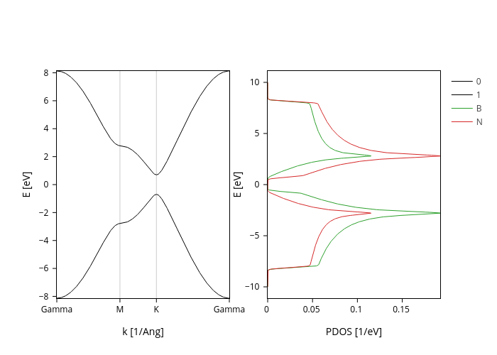
merge_plots(*plots, composite_method="multiple_x")
Much better, right? Now we can easily see that B contributes more to the bottom band, while N contributes more to the top band.
Subplots
Let’s try now to use the "subplots" method.
[9]:
merge_plots(*plots, composite_method="subplots")
By default it puts one plot on each row, but we can manage that with the arguments rows (number of rows), cols (number of columns), and arrange (if rows or cols are missing, way to determine the missing value, can be “rows”, “cols” or “square”).
Let’s put the two plots in separate columns:
[10]:
merge_plots(*plots, composite_method="subplots", cols=2)
Merging merged plots
We can recursively merge plots. Unfortunately however, for the moment only the top level merge method is taken into account. The other levels are simply taken as "multiple".
[11]:
merged_plot = merge_plots(*plots, composite_method="multiple_x")

merge_plots(
    merged_plot, bands_plot, composite_method="subplots", cols=2, backend="plotly"
)
In the future, separate axes within subplots might be supported.
Animations
Animations can be very cool but they are sometimes hard to build. merge_plots makes it as easy as possible for you, you just need to use the "animation" method.
Let’s create an animation to see the convergence of graphene’s PDOS with the number of k points. We first create the plots:
[12]:
# Define the number of k points that we are going to try.
# Do 1 by 1 from 1 to 12 and then in steps of 5 from 15 to 90.
ks = [*np.arange(1, 12), *np.arange(15, 90, 5)]

# Generate all plots.
# We use the scatter trace instead of a line because it looks better in animations :)
pdos_plots = [
    H.plot.pdos(
        data_Erange=[-10, 10],
        Erange=[-10, 10],
        kgrid=[k, k, 1],
        nE=1000,
        line_mode="scatter",
        line_scale=2,
    ).split_DOS(name="$species")
    for k in ks
]
Now all the heavy computation is done! We can merge the plots into an animation, using the ks as frame names. Other arguments that you can pass to an animation are frame_duration (in ms), transition (in ms) and redraw (Wether to redraw the whole plot for each frame).
Note
We suggest that you go to the last frame and click the house icon to set the y axis range. Then press play and see the PDOS converge!
[13]:
merge_plots(*pdos_plots, composite_method="animation", frame_names=ks)
This next cell is just to create a thumbnail
[14]:
merge_plots(*plots, composite_method="subplots", cols=2).show("png")
[ ]: