AtomicMatrixPlot
AtomicMatrixPlot allows you to visualize sparse matrices. This can help you:
Understand sparse matrices better, if you are new to them.
Easily introspect matrices to debug or understand how to implement new functionality.
[1]:
import sisl

import numpy as np
info:0: SislInfo: Please install tqdm (pip install tqdm) for better looking progress bars
Let’s create a toy Hamiltonian that we will play with. We will use a chain with two atoms:
C: With one s orbital and a set of p orbitals.
H: With one s orbital.
[2]:
# Create a C atom with s and p orbitals
C = sisl.Atom(
    "C",
    orbitals=[
        sisl.AtomicOrbital("2s", R=0.8),
        sisl.AtomicOrbital("2py", R=0.8),
        sisl.AtomicOrbital("2pz", R=0.8),
        sisl.AtomicOrbital("2px", R=0.8),
    ],
)

# Create a H atom with one s orbital
H = sisl.Atom("H", orbitals=[sisl.AtomicOrbital("1s", R=0.4)])

# Create a chain along X
geom = sisl.Geometry(
    [[0, 0, 0], [1, 0, 0]],
    atoms=[C, H],
    lattice=sisl.Lattice([2, 10, 10], nsc=[3, 1, 1]),
)

# Random Hamiltonian with non-zero elements only for orbitals that overlap
H = sisl.Hamiltonian(geom)
for i in range(geom.no):
    for j in range(geom.no * 3):
        dist = geom.rij(*geom.o2a([i, j]))
        if dist < 1.2:
            H[i, j] = (np.random.random() - 0.5) * (1 if j < geom.no else 0.2)
# Symmetrize it to make it more realistic
H = H + H.transpose()
Matrix as an image
The default mode of AtomicMatrixPlot is simply to plot an image where the values of the matrix are encoded as colors:
[3]:
plot = H.plot()
plot.get()
Changing the colorscale
The most obvious thing to tweak here is the colorscale, you can do so by using the colorscale input, which, as usual, accepts any colorscale that the plotting backend can understand.
[4]:
plot.update_inputs(colorscale="temps")
_ipython_canary_method_should_not_exist_ False
_ipython_display_ True
Note how the temps colorscale makes it more clear that there are elements of the matrix that are not set (because the matrix is sparse). Those elements are not displayed.
The range of colors by default is set from min to max. Unless there are negative and positive values. In that case, the colorscale is just centered at 0 by default.
However, you can set the crange and cmid to customize the colorscale as you wish. For example, to center the scale at 0.5:
[5]:
plot.update_inputs(cmid=0.5)
_ipython_canary_method_should_not_exist_ False
_ipython_display_ True
And to set the range of the scale from -4 to 1:
[6]:
plot.update_inputs(crange=(-4, 1))
_ipython_canary_method_should_not_exist_ False
_ipython_display_ True
Notice how ``crange`` takes precedence over ``cmid``. Now, to go back to the default range, just set both to None.
[7]:
plot.update_inputs(crange=None, cmid=None)
_ipython_canary_method_should_not_exist_ False
_ipython_display_ True
Show values as text
Colors are nice to give you a quick impression of the relative magnitude of the matrix elements. However, you might want to know the exact value. Although plotly shows them when you pass the mouse over the matrix elements, sometimes it might be more convenient to directly display them on top.
To do this, you need to pass a formatting string to the text input. For example, to show two decimals:
[8]:
plot.update_inputs(text=".2f")
_ipython_canary_method_should_not_exist_ False
_ipython_display_ True
You can tweak the style of text with the textfont input, which is a dictionary with three (optional) keys:
color: Text color.family: Font family for the text. Note that different backends might support different fonts.size: The size of the font.
The default value will be used for any key that you don’t include in the dictionary.
[9]:
plot.update_inputs(textfont={"color": "blue", "family": "times", "size": 15})
_ipython_canary_method_should_not_exist_ False
_ipython_display_ True
If you want the text to go away, set the text input to None:
[10]:
plot.update_inputs(text=None)
_ipython_canary_method_should_not_exist_ False
_ipython_display_ True
[11]:
plot = plot.update_inputs(textfont={}, text=".2f")
Separators
Sparse atomic matrices may be hard to interpret because it’s hard to know by eye to which atoms/orbitals an element belongs.
Separators come to the rescue by providing a guide for your eye to quickly pinpoint what each element is. There are three types of separators:
sc_lines: Draw lines separating the different cells of the auxiliary supercell.atom_lines: Draw lines separating the blocks corresponding to each atom-atom interaction.orbital_lines: Within each atom, draw lines that isolate the interactions between two sets of orbitals. E.g. a set of 3porbitals from one atom and ansorbital from another atom.
They all can be activated (deactivated) by setting the corresponding input to True (False).
[12]:
plot.update_inputs(
    sc_lines=True,
    atom_lines=True,
    orbital_lines=True,
)
_ipython_canary_method_should_not_exist_ False
_ipython_display_ True
Sometimes, the default styles for the lines might not suit your visualization. For example, they might not play well with your chosen colorscale. In that case, you can pass a dictionary of line styles to the inputs.
[13]:
plot.update_inputs(
    orbital_lines={"color": "pink", "width": 5, "dash": "dash", "opacity": 0.8},
    sc_lines={"width": 4},
    atom_lines={"color": "gray"},
)
_ipython_canary_method_should_not_exist_ False
_ipython_display_ True
Labels
You might want to have a clearer idea of the orbitals that correspond to a given matrix element. You can turn on labels with set_labels:
[14]:
plot.update_inputs(set_labels=True)
_ipython_canary_method_should_not_exist_ False
_ipython_display_ True
Labels have the format: Atom index: (l, m). where l and m are the quantum numbers of the orbital.
[15]:
plot = plot.update_inputs(set_labels=False)
Showing only one cell
If you only want to visualize a given cell in the supercell, you can pass the index to the isc input.
[16]:
plot.update_inputs(isc=1)
_ipython_canary_method_should_not_exist_ False
_ipython_display_ True
To go back to visualizing the whole supercell, just set isc to None.
[17]:
plot.update_inputs(isc=None)
_ipython_canary_method_should_not_exist_ False
_ipython_display_ True
Arrows
One can ask for an arrow to be drawn on each matrix element. You are free to represent whatever you like as arrows.
The arrow specification works the same as for atom arrows in GeometryPlot. It is a dictionary with the key data containing the arrow data and the styling keys (color, width, opacity…) to tweak the style.
However, there is one main difference. If data is skipped, vertical arrows are drawn, with the value of the corresponding matrix element defining the length of the arrow:
[18]:
plot.update_inputs(arrows={"color": "blue"}).show("png")
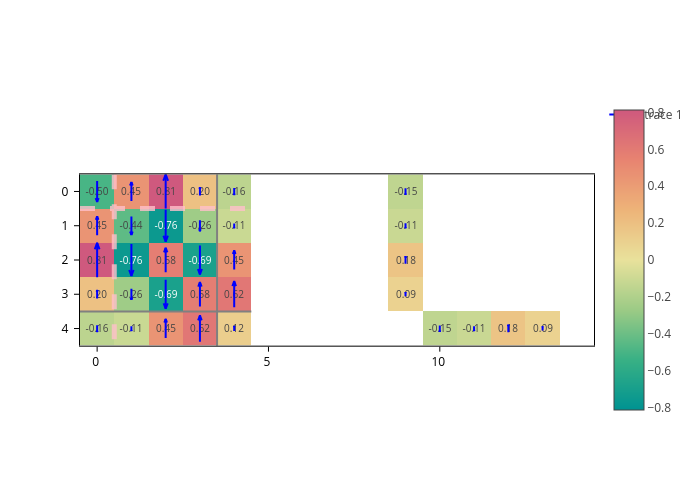
Arrows are normalized so that they fit the box of their matrix element.
It may be that pixel colors and numbers make it difficult to visualize the arrows. In that case, you can disable them both. We have already seen how to disable text. For pixel colors there’s the color_pixels input, which is a switch to turn them on or off:
[19]:
plot.update_inputs(color_pixels=False, text=None)
_ipython_canary_method_should_not_exist_ False
_ipython_display_ True
If you want to plot custom data for the arrows, you have to pass a sparse matrix where the last dimension is the cartesian coordinate (X, Y). Let’s create some random data to display it:
[20]:
# Initialize a sparse matrix with the same sparsity pattern as our Hamiltonian,
# but with an extra dimension that will host the X and Y coordinates.
arrow_data = sisl.SparseCSR.fromsp(H, H)

# The X coordinate will be the Hamiltonian's value,
# while the Y coordinate will be just random.
for i in range(arrow_data.shape[0]):
    for j in range(arrow_data.shape[1]):
        if arrow_data[i, j, 1] != 0:
            arrow_data[i, j, 1] *= np.random.random()

# Let's display the data
plot.update_inputs(arrows={"data": arrow_data, "color": "red"})
_ipython_canary_method_should_not_exist_ False
_ipython_display_ True
Finally, we showcase how you can have multiple specifications of arrows.
We also show how you can use the center key. You can set center to "start", "middle" or "end". It determines which part of the arrow is pinned to the center of the matrix element (the default is "middle"):
[21]:
plot.update_inputs(
    arrows=[
        {"color": "blue", "center": "start", "name": "Hamiltonian value"},
        {"data": arrow_data, "color": "red", "center": "end", "name": "Some data"},
    ]
)
_ipython_canary_method_should_not_exist_ False
_ipython_display_ True